Websites
Challenge: design the simplest resort website ever.


BLANCHARD
I’ve been talking about websites this week and wanted to resurface this post from a few years ago. Resort websites, in my opinion, are largely much more complicated than they need to be. One solution I’ve found is to start with the most dead-simple concept you can and then have to make a case for every feature you add. So, within that theme, here’s something to get the wheels turning.
As I was going back through old posts on Presidents Day I saw a theme that really got the wheels turning.
First was how much I love simplicity, second was how I’d capitalize on email lists generated by contests, third was the idea of building your own Groupon Getaways list, and finally I circled back to the potential that lies in leads. Along the way, I pulled in a few more that you’ll see below.
I often hear resort websites are too complex (I usually agree), so I made myself a challenge that went to the far side of the website-complexity spectrum: how simple of a resort website could I design by moving some of the functionality into email.
One, Two, Three
After some sketching, this is what I ended up with. The structure I went with had three pieces and featured a nice hero image I *ahem* borrowed from Ragged Mountain that would tell as much of the story as possible (in this case, being outdoors/in the mountains).
- Succinct “value call” (a headline type I’ve been playing with that’s super-short and something between a “call to action” and “value proposition”) – with a focus on what’s unique or a superlative in the tagline
- Four key selling points or reasons why people may enjoy the resort – not necessarily unique, just describing the product a bit more
- An experimental opt-in form idea I’ve been chewing on that has hidden checkboxes “disguised” as “more info” tabs that turn clicks into data points for segmentation.
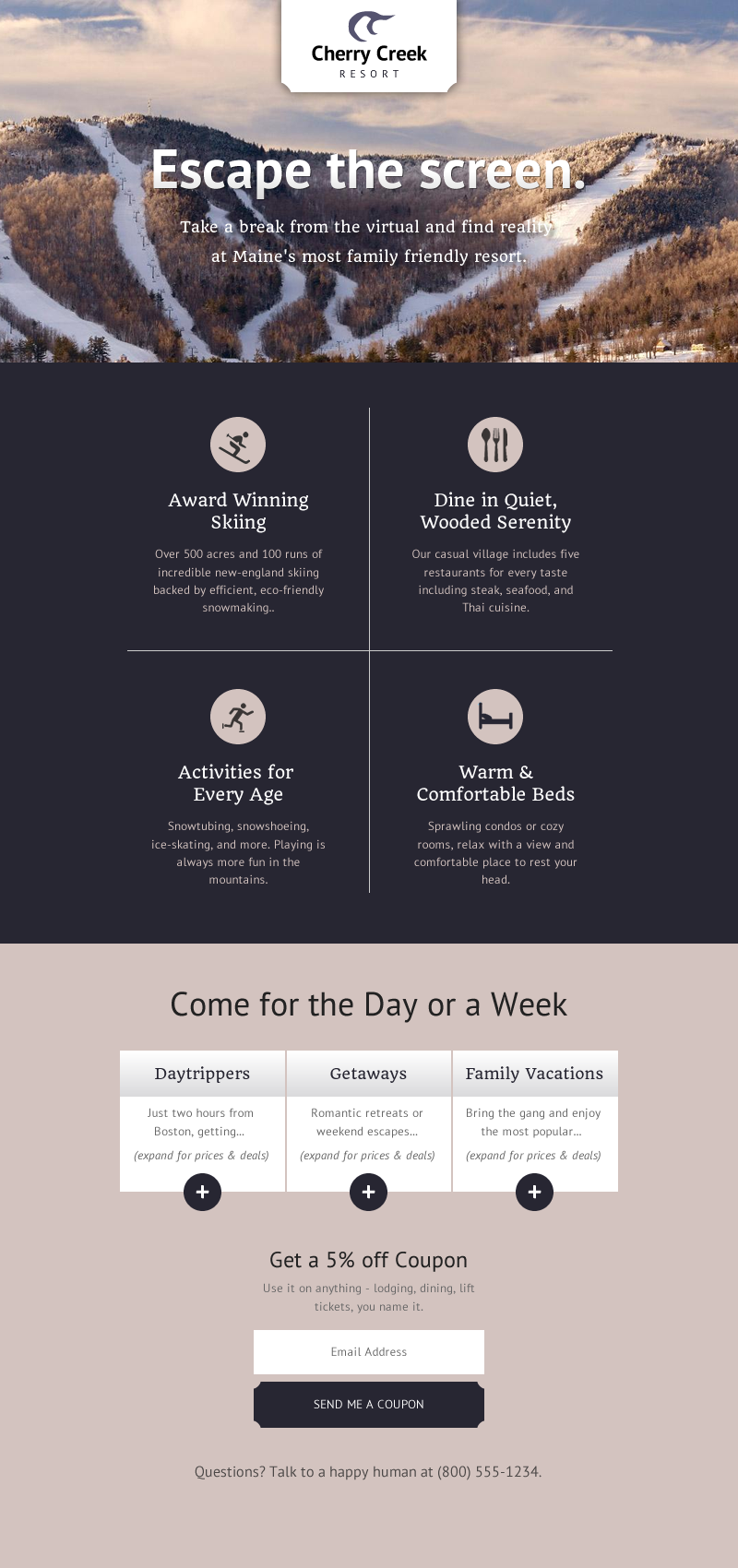
So instead of cramming 100 things into one page, I’ve turned this into a squeeze page with the sole focus of getting as many people to opt-in as possible. And, along the way, getting them to opt-in with (hopefully) a bit of insight attached to their email.
Off the Page With Ya…
Actually, let’s look closer at that bottom section. The whole goal of the table is to get people to indicate a behavior type. The hidden text and plus signs are there to lure people into clicking. When they click, that tells me something about what type of visitor they’d be (local, destination, destination-family).
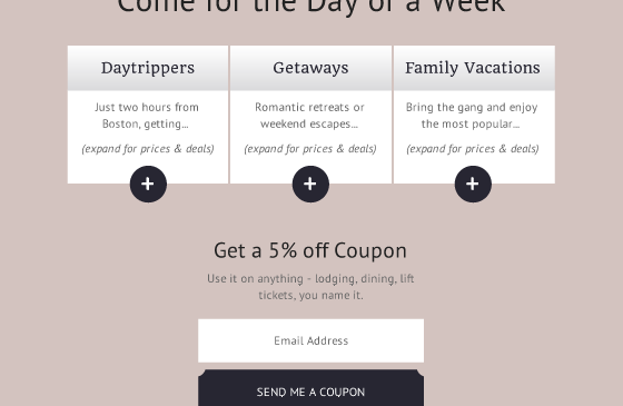
With that information, I’d then stick them into a individual segments with dedicated follow-up messaging for each. Design I can fake in a few minutes, but not so with email strategy.
So, while not perfect, the basic idea is to follow up with a steady drip of reasons, tips, and deals (aka, the rest of a normal website) all tied to the original theme they were sold on (daytripper + escape screens) finished off by a signature that lets them build a relationship with someone behind the scenes.

One Focus
I’ve talked a lot about focused-UI in terms of apps recently but I think the same is true for websites.
If the focus is on one, simple step that provides them value and the rest of the communication is shifted over into another, more personal channel, I think that a site like this could actually work for a large portion of first-time visitors.
You’ve probably got an idea of your own. How would you build the simplest resort website ever?
About Gregg & SlopeFillers
I've had more first-time visitors lately, so adding a quick "about" section. I started SlopeFillers in 2010
with the simple goal of sharing great resort marketing strategies. Today I run marketing for resort ecommerce and CRM provider
Inntopia,
my home mountain is the lovely Nordic Valley,
and my favorite marketing campaign remains the Ski Utah TV show that sold me on skiing as a kid in the 90s.
Get the weekly digest.
New stories, ideas, and jobs delivered to your inbox every Friday morning.